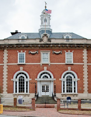
 One of the most beautiful buildings in Annapolis is on the corner of Church Circle and Northwest Street. The United States Post Office was designed in 1901 by the U. S. Treasury Department. James Knox Taylor was the Supervising Architect of the Treasury at the time, and made a deliberate effort to build federal buildings that would make lasting contributions to small towns. Clearly this building does more than simply provide basic shelter.
 The architect skillfully blends classical design with architectural elements found specifically in Annapolis. The goal of this composition is architectural balance and harmony, while using materials and forms familiar to Annapolis. There is just enough monumentality in the design to let you know it is an important building. The monumentality never over-reaches to grandeur, mostly because of the use of brick, a building material strongly associated with Annapolis.
The brick used at the Post Office is laid in an alternating header bond pattern. That is, every other horizontal course shows the narrow end of the brick to the street. Superimposed on this is another pattern: the dark burnt brick ends that are laid in a chevron design. This causes a strong crisscross pattern that floats across the front of the brick wall. The use of burnt bricks in decorative wall design is a Maryland masonry tradition dating to the 1600’s. There is a fragment of burnt brick chevron design on the rear of the James Brice house, on the corner of Prince George and East Streets.
The three round arch windows are another familiar Annapolis architectural form. These can be seen right across the street at Saint Anne’s Church (1859). Flanking the three round arches are two blind arches with inset windows. Blind arches are arches with brick infill, as seen in the Church apse, facing the Governor’s house.
There are two other classical architectural forms used at the Post Office that are found throughout Annapolis: one is the use of quoins at the corner of the brick walls, and the other is the belt course. In the Post Office these are made of limestone. The corner quoins give the building a vertical element. The belt course at the bottom of the second floor window sills provides a subtle horizontal line. Corner quoins are used at St. John’s College McDowell Hall (1744). Brick belt courses can be found on brick buildings around the city, mostly on buildings of the late 1700s. One of the most interesting designs of the Post Office is where the belt course intersects the corner quoins. At this intersection the architect created a unique stone shape that has an inverted pan face. This piece allows the vertical corner quoins and the horizontal belt course to cross in a wonderfully harmonious way. The quoins and the belt course share the same space without conflict, achieving balance and harmony. Notice the way the brick wall patterns knit into the stone quoins. The visual effect is vibrant and complex, but the result is orderly and resolute.
The craft and workmanship of the Post office is outstanding. The tooling of the limestone base is very subtle. Around the three arched windows, the decorative limestone pieces are expertly carved. The two garlands that flank the second floor center window are a three dimensional stone carving extravaganza. They float on the wall with no visible means of support. The blue slate “damp course” where the grass meets the building is used to protect the soft limestone base from wicking up soil moisture. This protects the soft porous limestone from deterioration. Today the stone and brick are as fresh at the day they were built. The interior wood work and finishes are all beautifully executed, especially the staircase in the side vestibule.
When the Post Office was built two grand important Annapolis houses were demolished. Early photographic views show substantive homes, as one would expect to find in such a prominent location. Unfortunately, their demolition was just the start of the destruction of the entire area defined now by Northwest, Church Circle, Bladen, and Calvert Streets. This area included Bloomsbury Square, a feature of the original city plan designed by Sir Francis Nicholson in 1695, which included a number of homes of free African Americans.
The beauty of the Post Office was followed in short order by beastly bland pseudo-colonial state office buildings. Occupying what were previously many city blocks, these buildings have none of the architectural interest, none of the creativity, none of the craft of the Post Office. The most marked contrast between the Post Office and the state office buildings is the way they engage the sidewalk. The Post Office is warm, inviting and encourages participation. The state office buildings turn away from the sidewalk. The James Senate Office Building (1939) next door is the most noble of all of the state office buildings. Unfortunately it has just suffered an ignoble insult: the front entrance door on College Avenue has been locked to public access. The state office buildings continue their march toward an isolated insular campus.
The Post Office survives… for a while. The canopy over the front door sags; the columns of the cupola are split open, eviscerated by neglect, the garlands around the cupola are falling off. The Annapolis Post Office is looking for a new home, they just want a shelter this time…nothing fancy.
Chip Bohl has been an architect in Annapolis for 33 years, visit www.BohlArchitects.com to see his work.
